RESULT
BACKGROUND
As lead product designer, I owned the complete design process from brand identity through final prototype delivery. I worked with one other designer and directly with the startup client, making all critical design decisions across current functionality and future-facing features.
A startup approached with a clear product vision: an app that simplifies finding and reserving parking. What they didn't have: brand identity, defined product scope, or UX strategy.
The brief: translate a high-level idea into a tangible prototype that could attract investors. Full creative control, no legacy constraints, every decision made for the right reasons.
The constraint was time. Six weeks for brand, core experience, and two future-facing integrations.
PROCESS
Branding
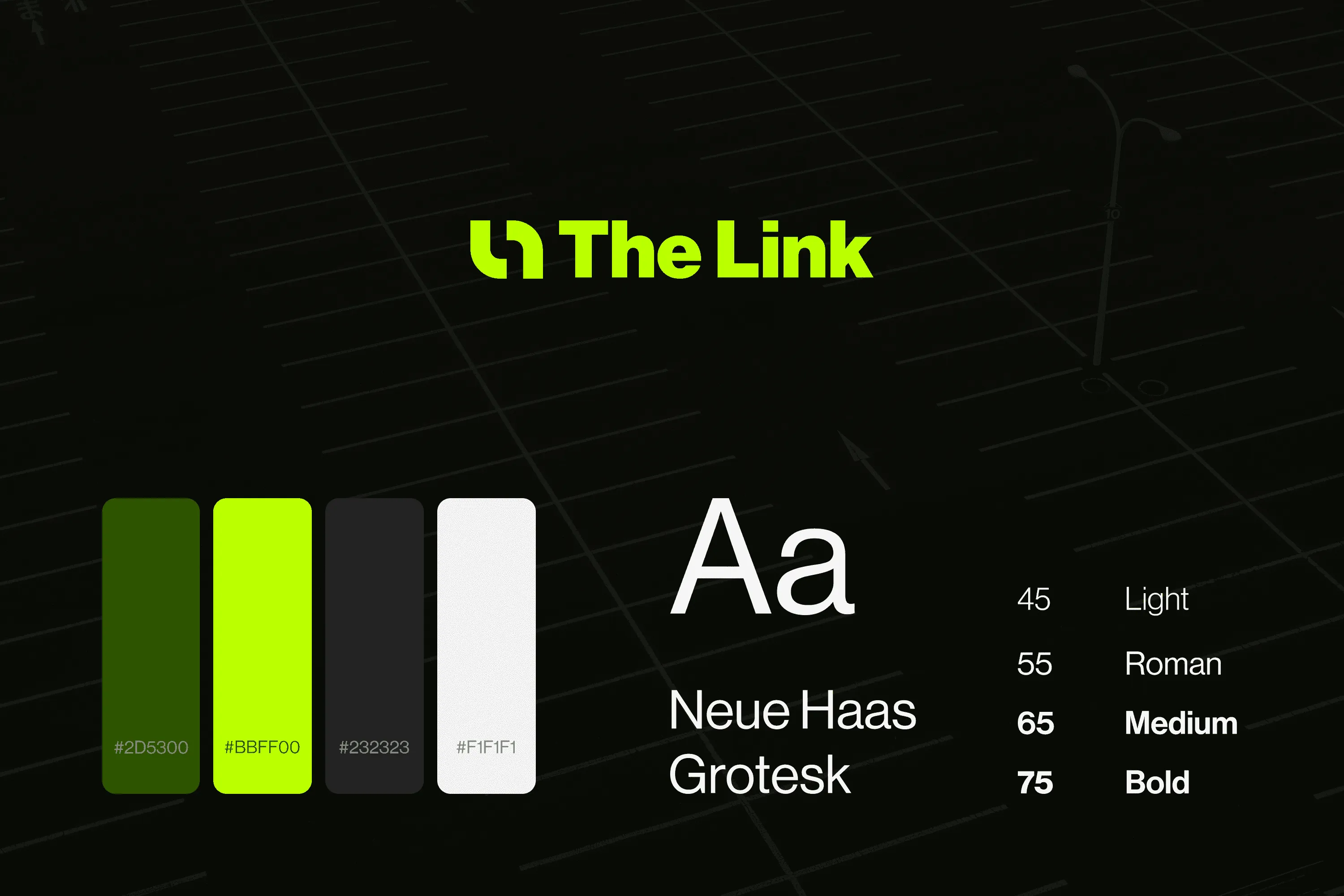
Without an existing visual identity, every decision needed to establish credibility while supporting a utility-focused product with future tech aspirations.
Strategic positioning: Utility-focused, premium, future-facing. The brand needed trustworthiness for financial transactions while appearing innovative enough for tech-forward investors.
Visual System
LOGO
Minimalist mark suggesting connection and precision
COLOR
Vibrant lime and dark green, strong recognition with readability and accessibility
TYPOGRAPHY
Clean, accessible typeface supporting both utility and sophistication
Core Experience
Rather than solving every parking problem, I focused on one well-executed user journey: discovery to reservation completion.
USER NEEDS
- Finding nearby parking with real-time availability
- Reserving spaces in advance with confidence
- Automating payments, including highway tolls
KEY DESICIONS
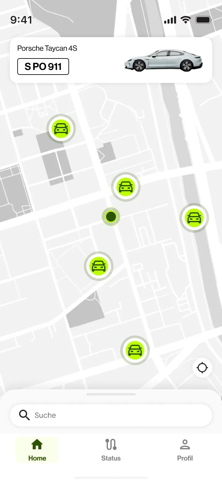
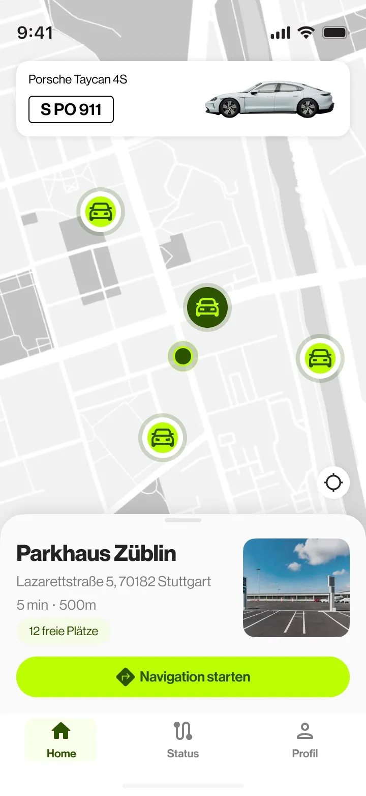
- Map-first interface: parking is spatial, lead with location
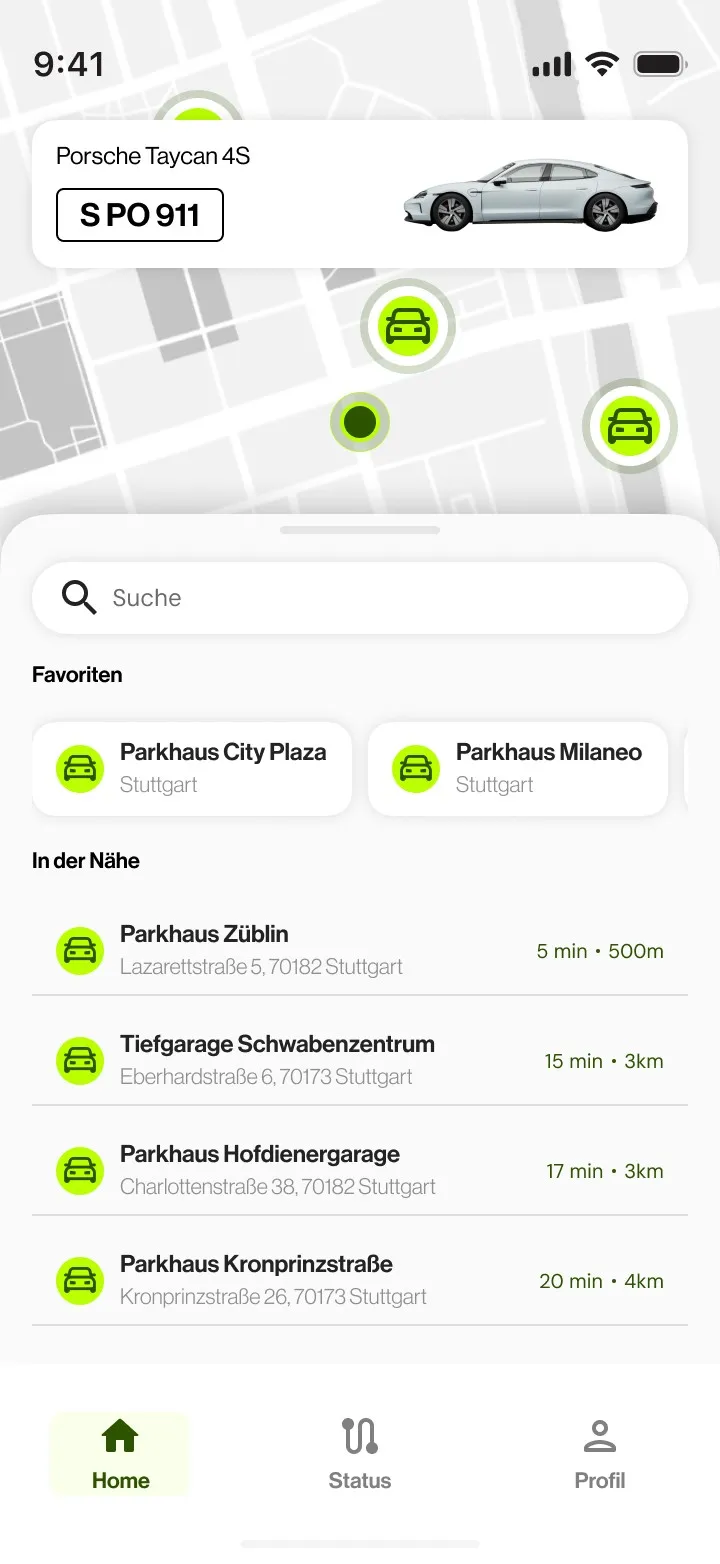
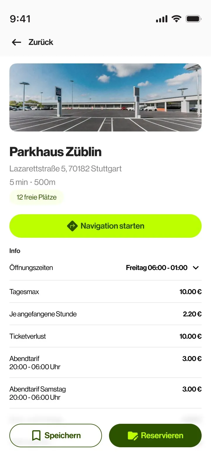
- Progressive disclosure: essential information immediately, details on demand
- Single-flow focus: one journey done well, not everything done superficially
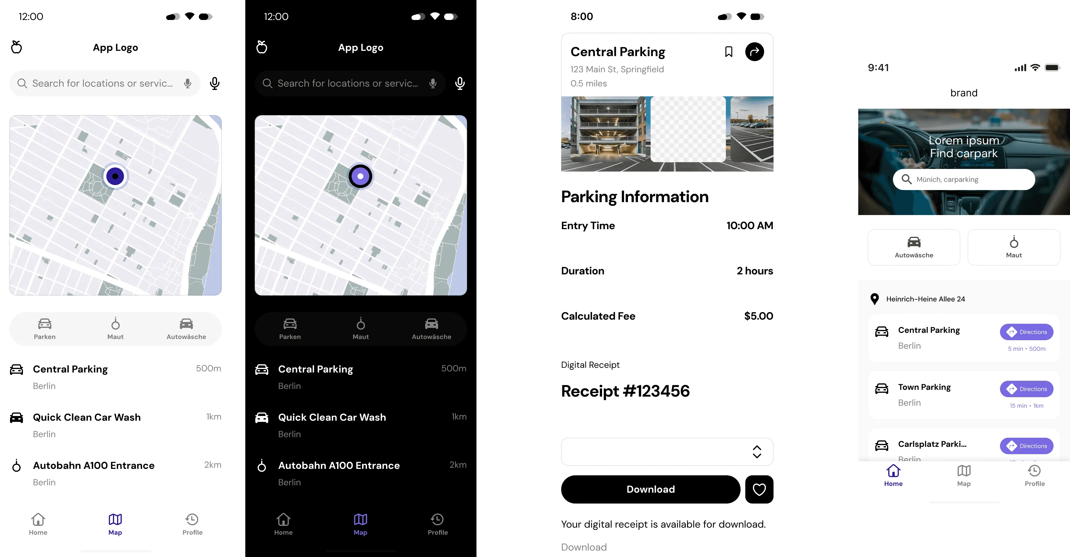
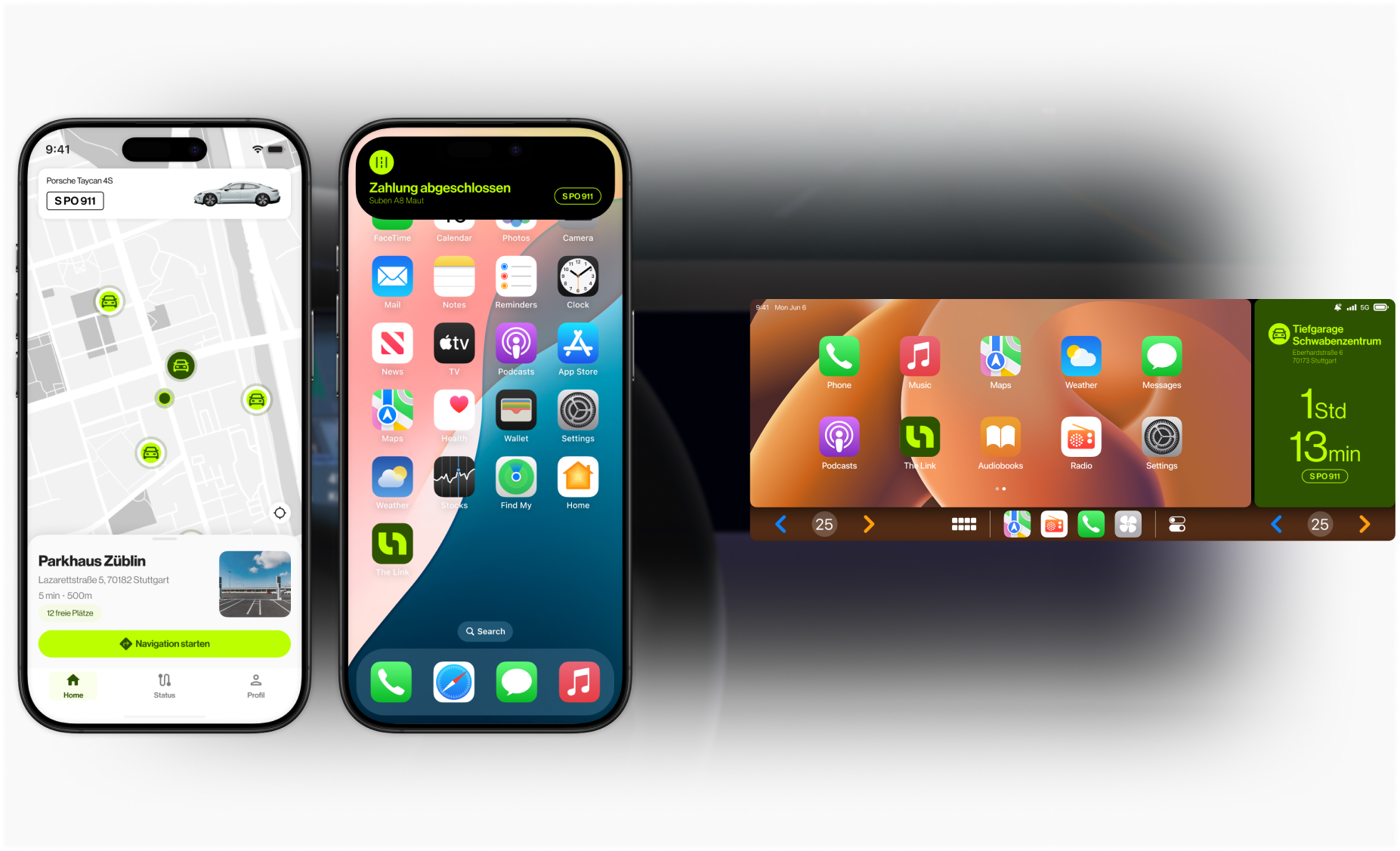
The flow: Map-based discovery with real-time availability indicators and contextual information (distance, driving time, pricing) at a glance. Streamlined reservation with clear progression, transparent pricing upfront, including fees and tolls, and flexible duration adjustment. Frictionless payment with stored methods, automated toll integration, and instant confirmation.
Future-Forward Integrations
The differentiator in this MVP wasn't the core parking flow; most competitors have that. It was the two integrations that extended the product beyond the app itself.
iOS Live Activities
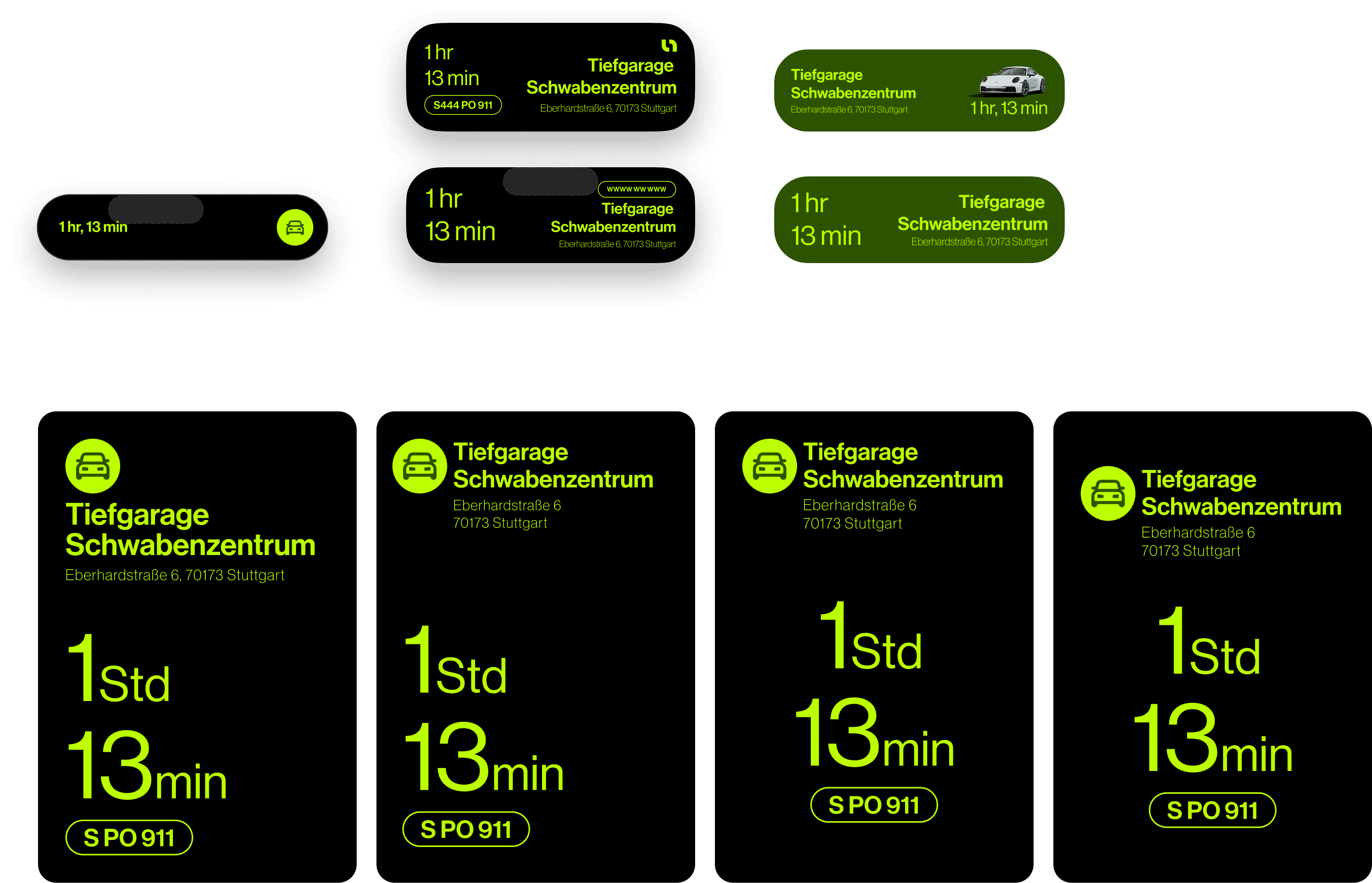
Parking sessions don't end when users leave the app. Live Activities keep essential session information on the lock screen without requiring active engagement.
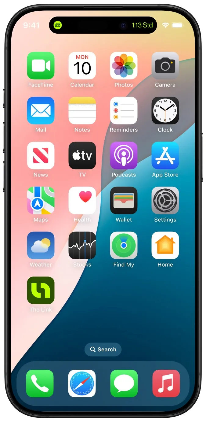
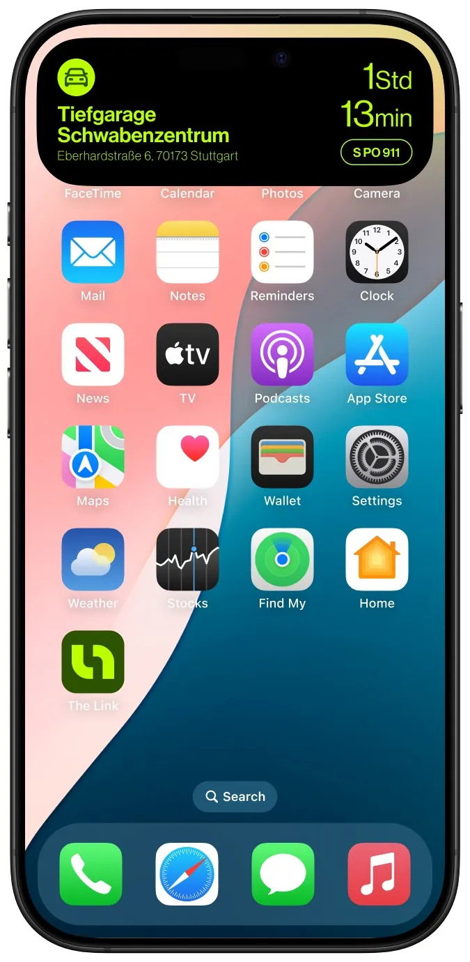
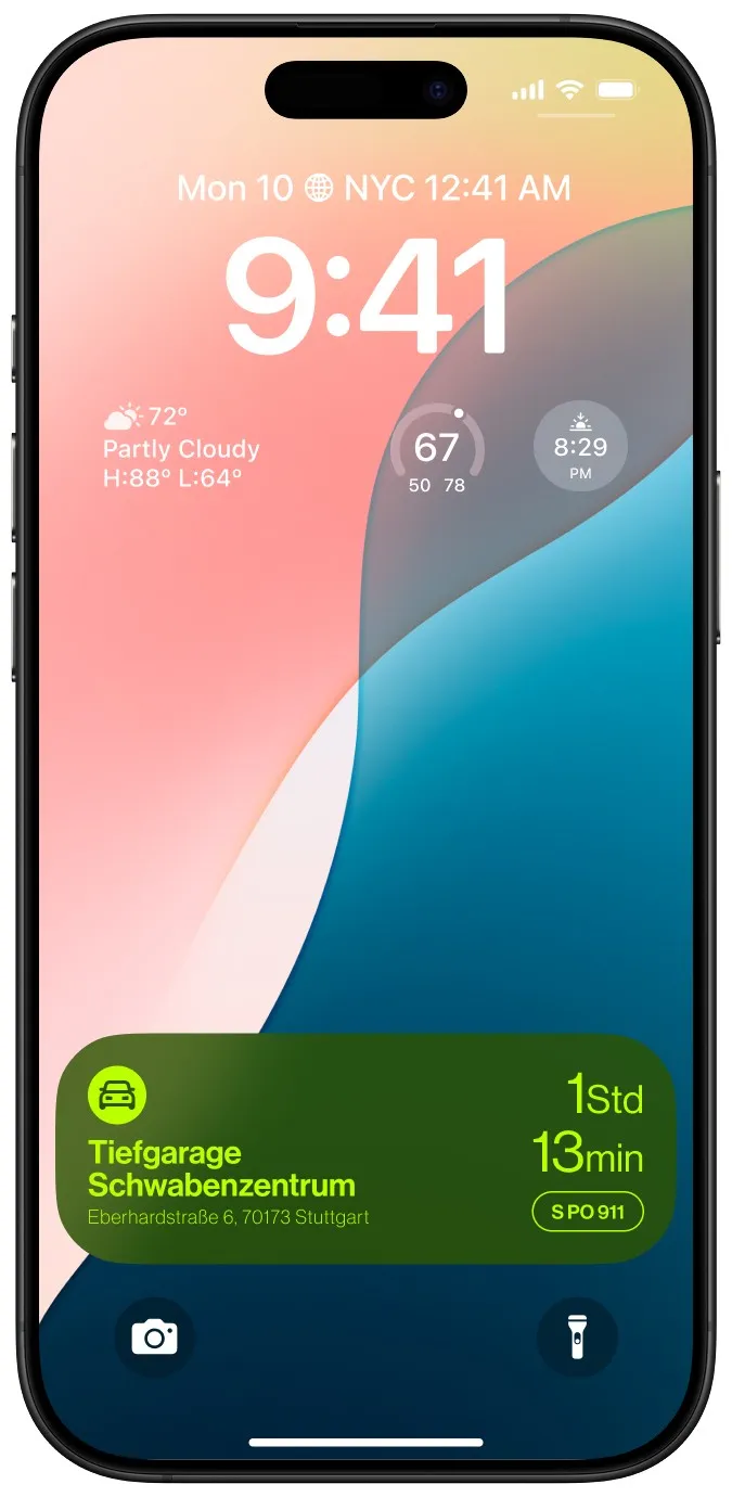
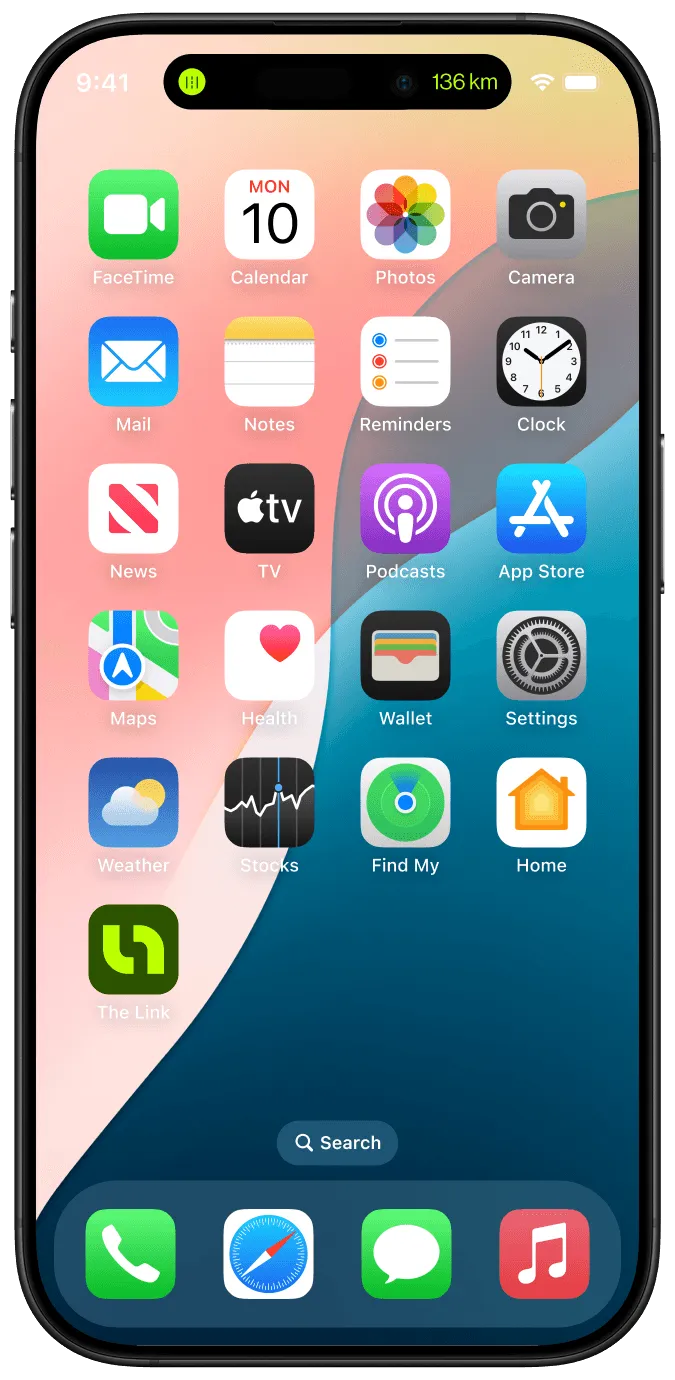
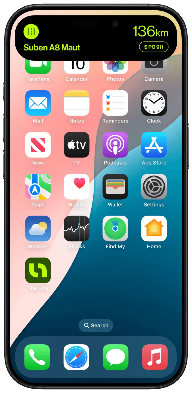
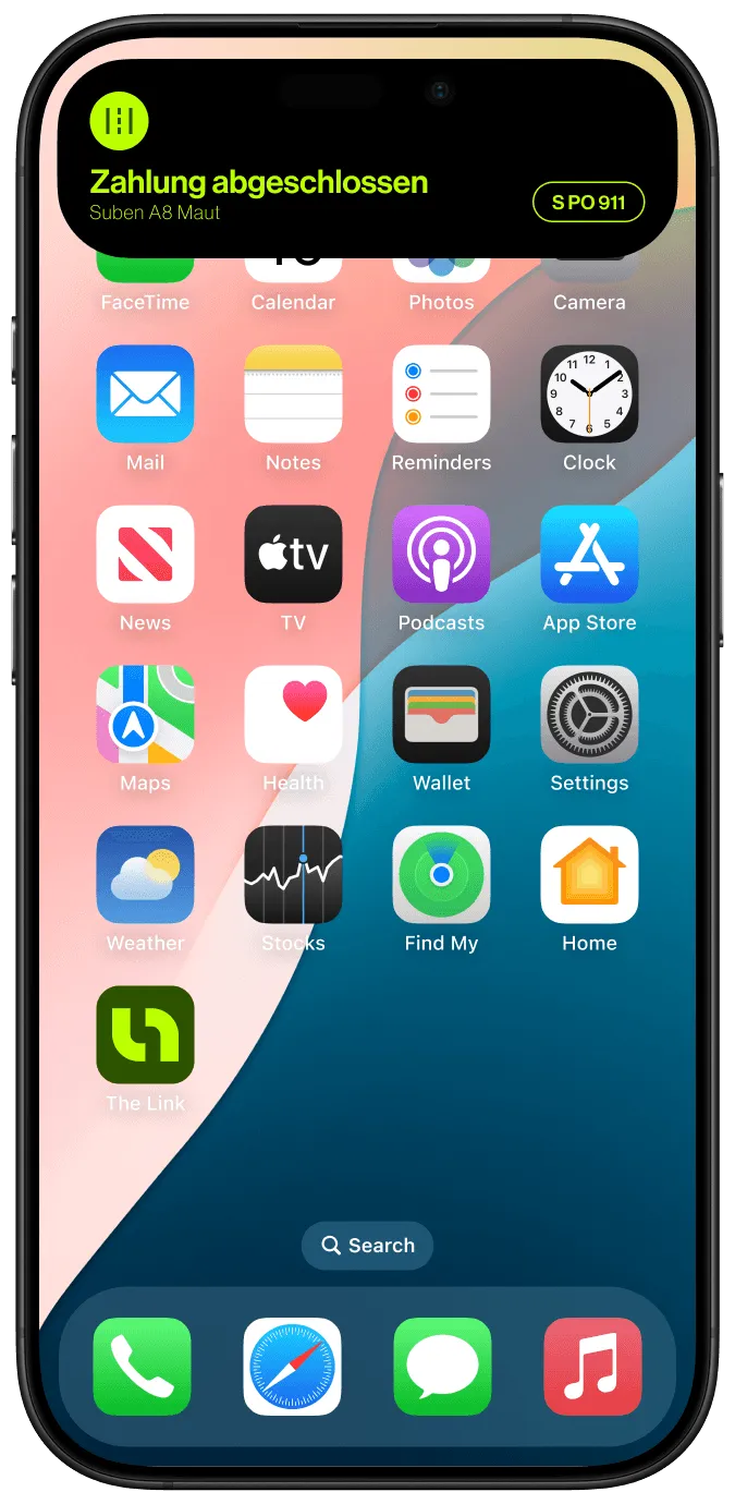
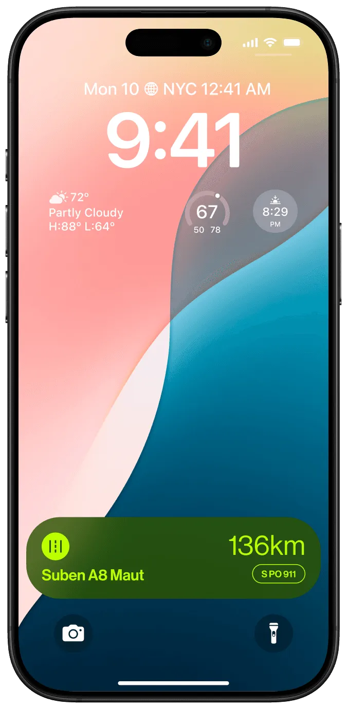
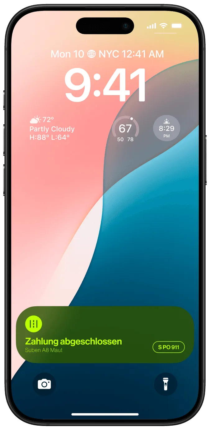
Designed states: Active parking with a countdown timer, payment status with automatic extension options, and quick actions for extending time or ending early.
Design constraints: Glanceable in a single look, minimal real estate, and real-time updates without notification overload.
CarPlay Integration
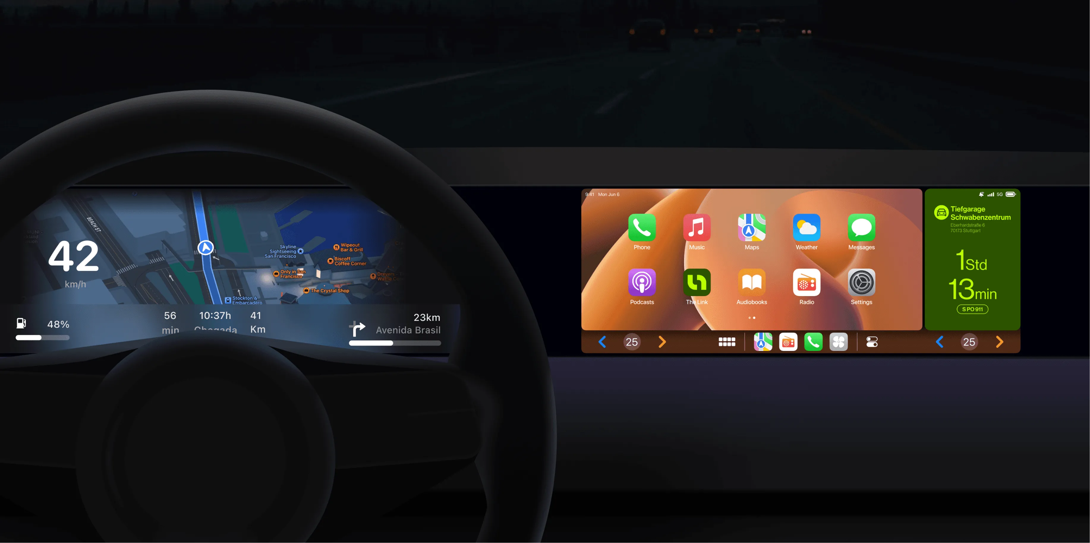
Building on the iOS Live Activities concept, I explored how parking session information could display within CarPlay's dashboard interface.
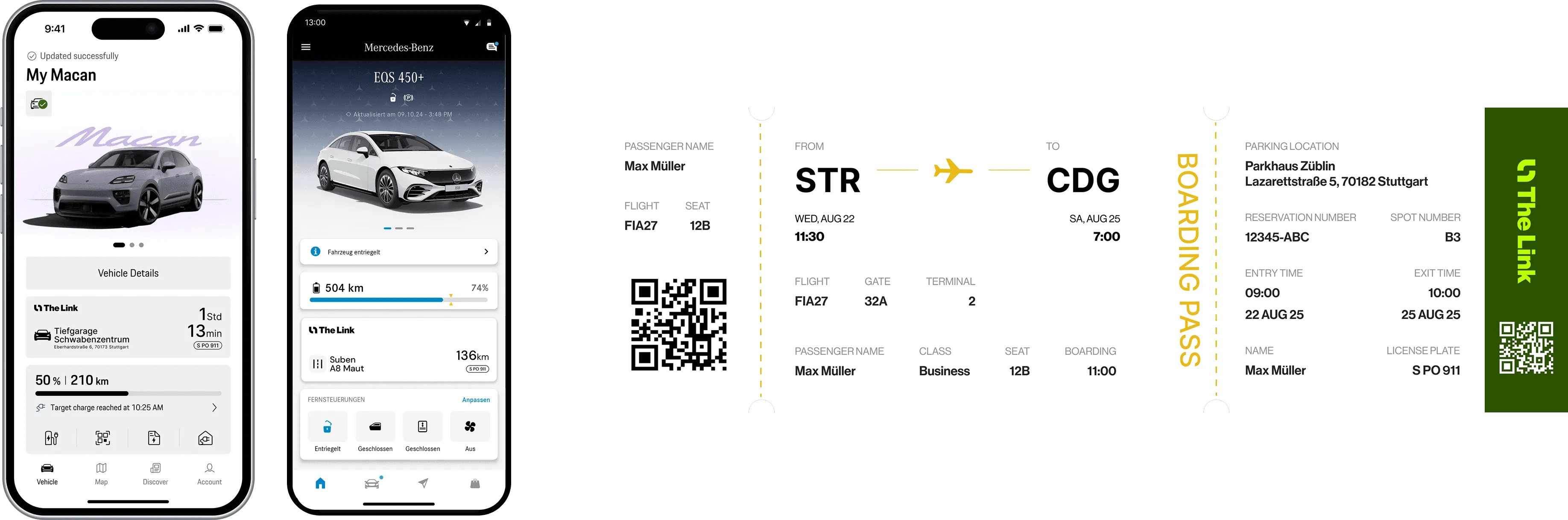
Before designing anything, I analyzed premium in-vehicle interfaces from Porsche and Mercedes-Benz. Three principles emerged: minimal visual complexity, large glanceable typography, and contextual relevance tied to location and session state. These shaped every CarPlay design decision.
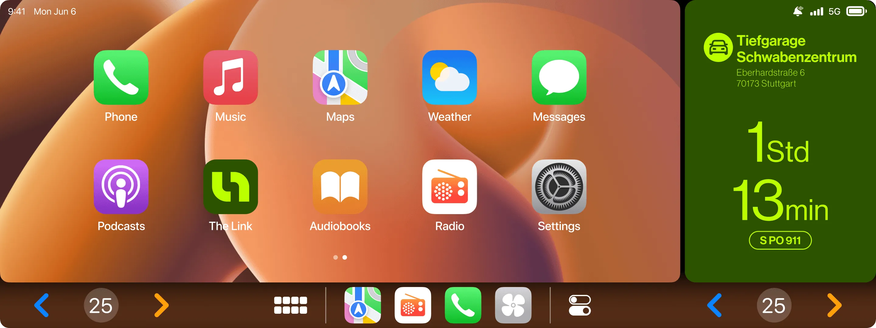
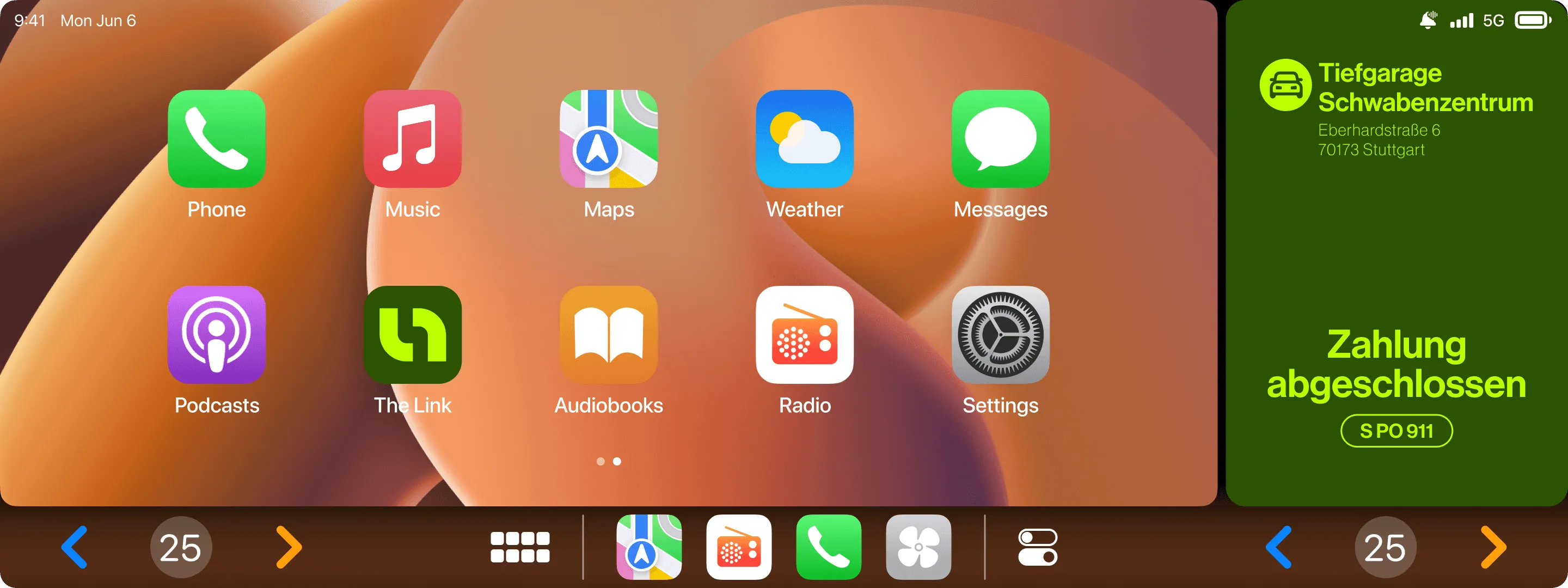
Dashboard display: Live session status, time remaining with a clear countdown, contextual appearance tied to location and session.
Automotive-specific constraints: Information readable while driving, minimal cognitive load, lime and dark green palette adapted for dashboard context.
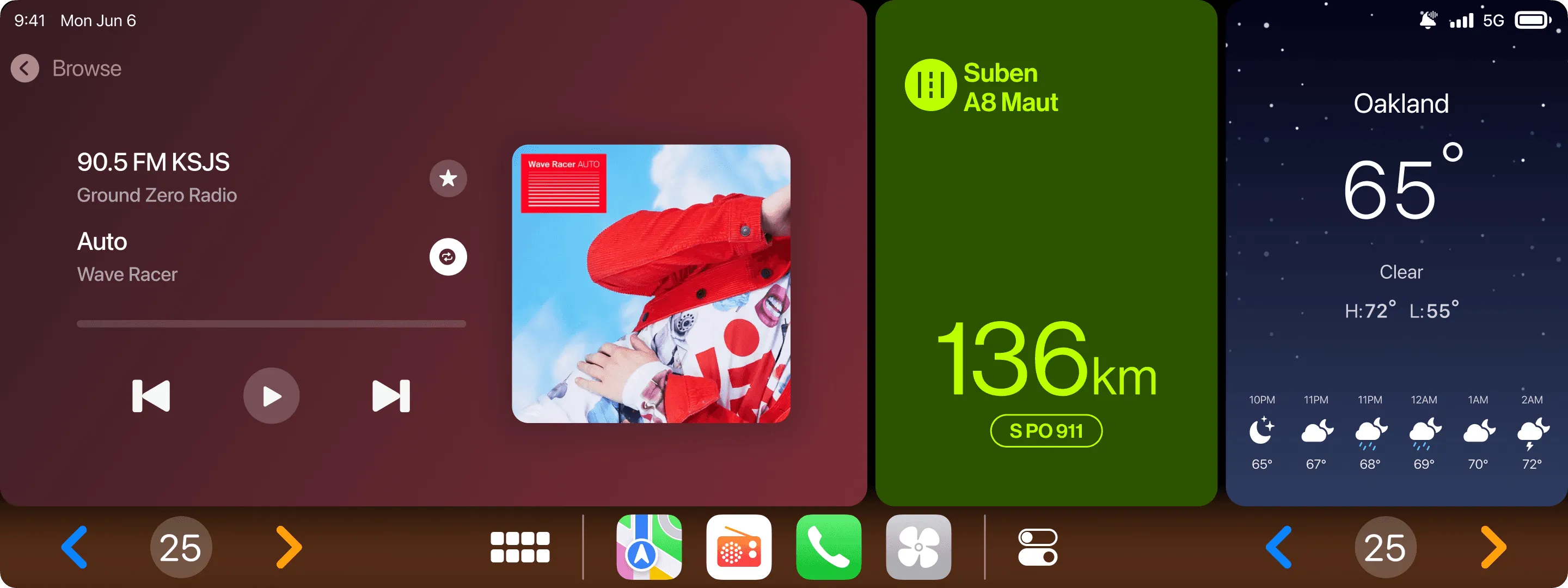
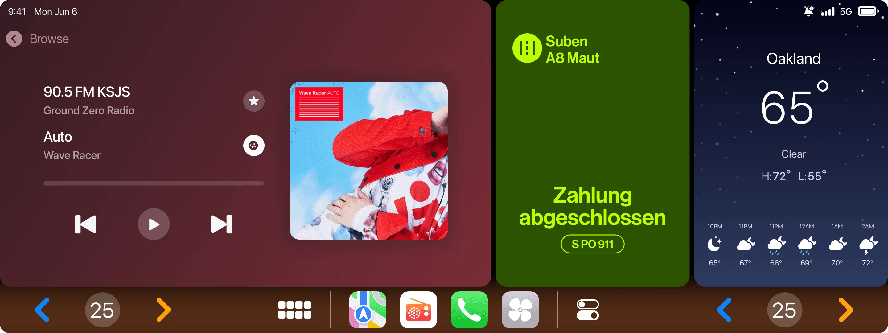
APCOA FLOW, the primary competitor, has no native in-vehicle session management. This integration creates a genuine category differentiator.
REFLECTION
Starting brand and core experience in parallel, rather than sequentially, created a natural alignment that wouldn't have happened otherwise. Brand decisions informed UX decisions in real time and vice versa. The lime color that works for a logo also works as a real-time availability indicator; that kind of coherence is hard to plan for, it emerges from simultaneous development.
The CarPlay integration revealed something about designing for different innovation tolerances within the same product. The core parking flow is conservative by necessity because users need trust for financial transactions. The integrations could push further precisely because they're layered on top of an established foundation.