RESULT
All four design interventions were reviewed and approved by the client, Intilio's founder and primary user, who had shaped the original tool over the years. Sign-off from a domain expert with strong existing mental models was the primary validation for commercial readiness.
BACKGROUND
I inherited an in-progress system from my design manager and owned UX/UI design end-to-end for four features: project flow redesign, contacts module, notifications system, and projects timeline visualization. I worked directly with the development team and navigated client requirements.
Intilio was an internal tool built around one user's workflow over several years. Ad-hoc customization created inconsistent patterns, poor information hierarchy, and no systematic approach to complex data. All of it unsuitable for commercial use.
The brief: deliver targeted, high-impact UX interventions within a pre-established design system. No full redesigns. Work within what was already built.
The constraints made this harder than a blank-slate project. Some components couldn't be touched. Documentation was in German with limited context. Direct access to end users beyond the client-founder wasn't available, so competitive analysis and systematic review of construction workflows substituted for user research.
PROCESS
Understanding the Inherited System
I mapped the existing patterns, style guide, and technical limitations before proposing any direction. Without a formal handoff, this meant building system understanding from the components themselves and the client documentation.
Four Design Interventions
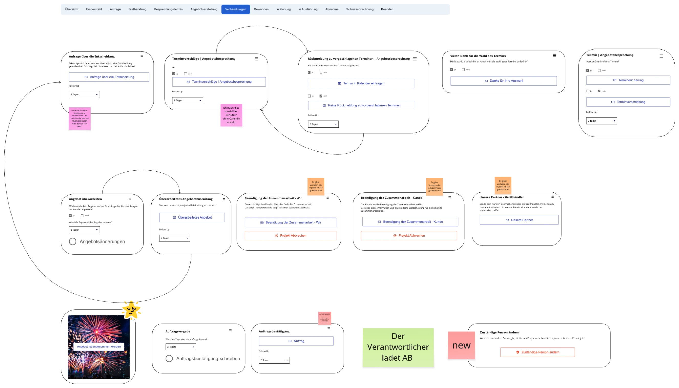
1. Project Flow
Problem: Segmented controls with listed cards created cognitive overload and poor hierarchy.
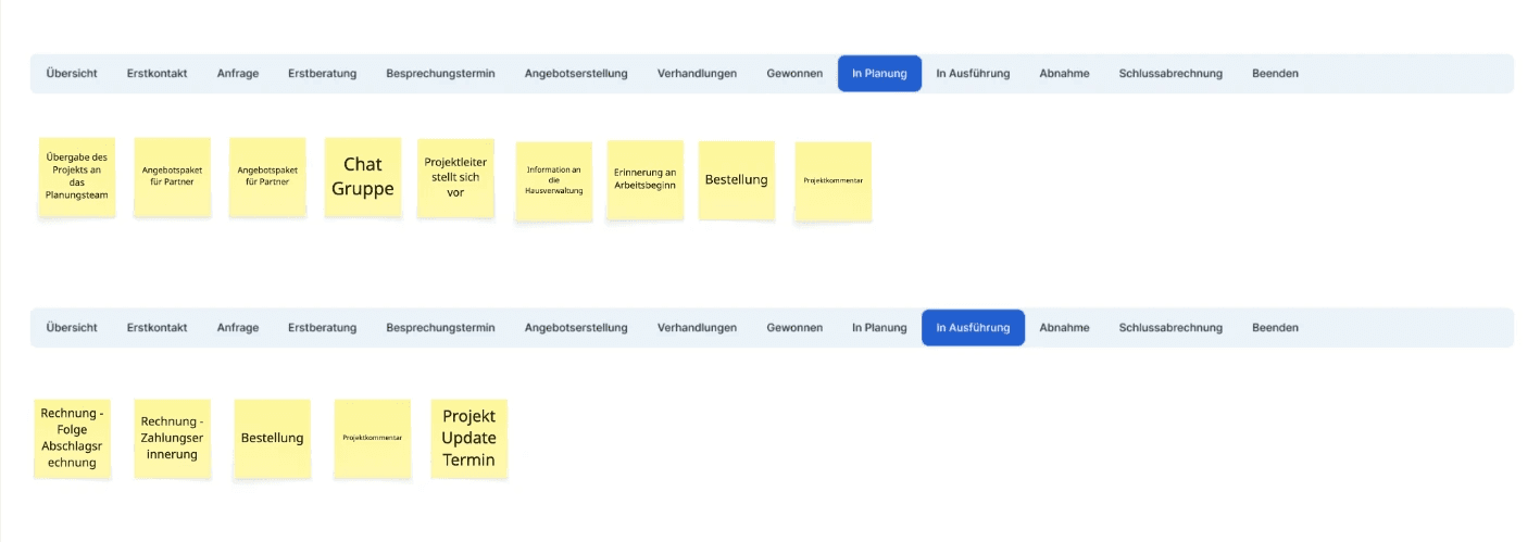
Solution: Replaced segmented controls with collapsible tabs. Progressive disclosure so users see only what's relevant to their current stage, scalable across varying project volumes.

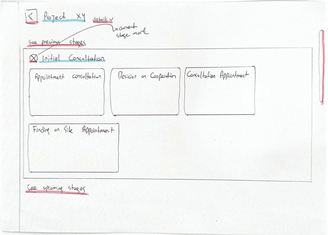
Why these decisions: Construction managers work across multiple lifecycle stages simultaneously. Familiar tab patterns reduce the learning curve; a collapsible structure keeps the interface from collapsing under data density.
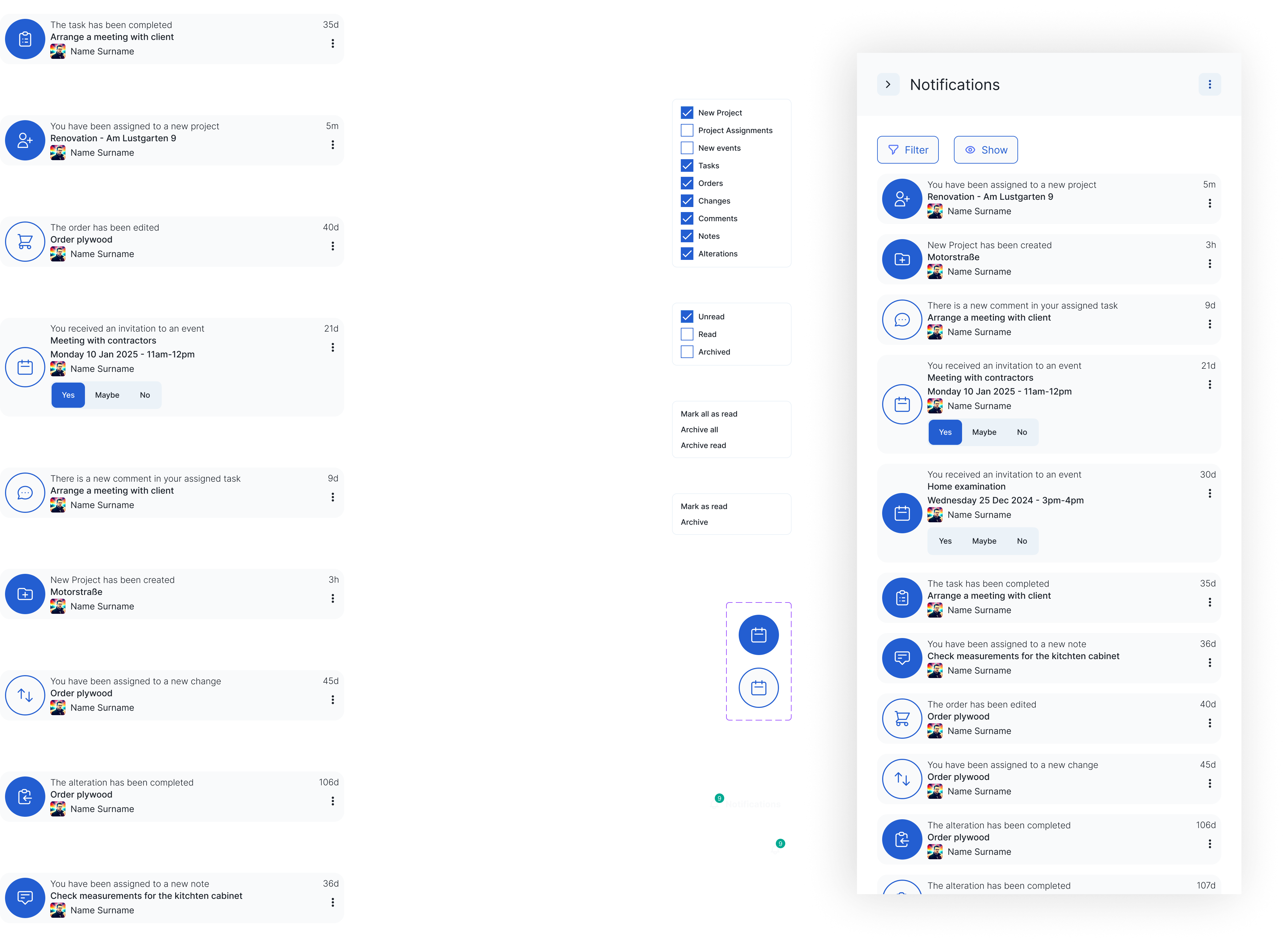
2. Notifications System
Problem: No web notifications existed. The mobile version had basic notifications, poorly designed.
APPROACH
- Analyzed the mobile version for notification types and user needs
- Wireframed web-appropriate patterns from scratch
- Evolved wireframes into a complete interaction system
SYSTEM DELIVERED
- Read/unread state indicators
- Filtering by notification type and read status
- Archive and mark-as-read/unread actions
- Visual hierarchy for priority notifications
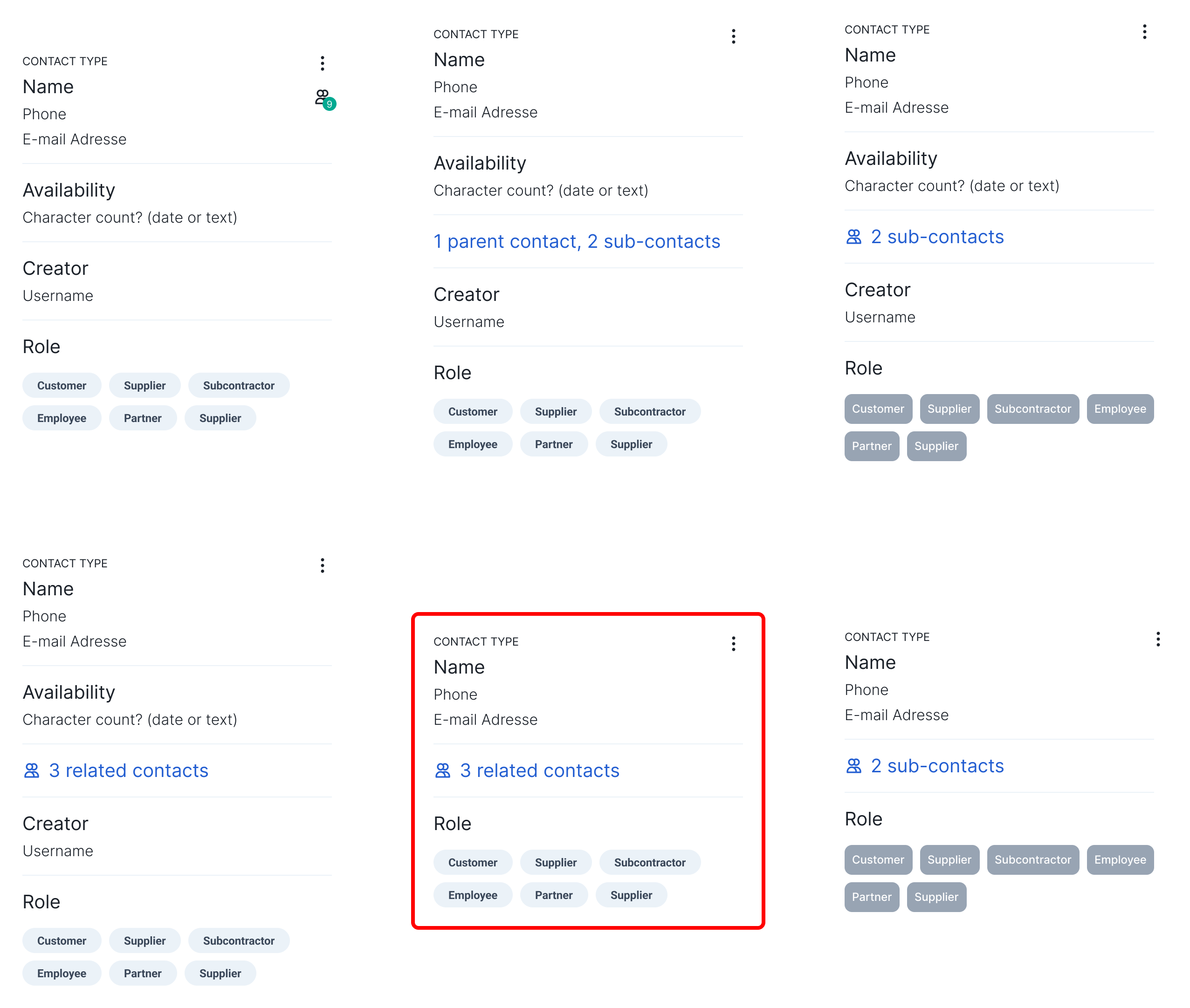
3. Contacts Module
Problem: Traditional table format, functional but dated, with poor scannability for relationship management.
Solution: Card-based contact system with clear visual hierarchy, iterated across multiple rounds of client feedback. Information density preserved, visual clarity improved.
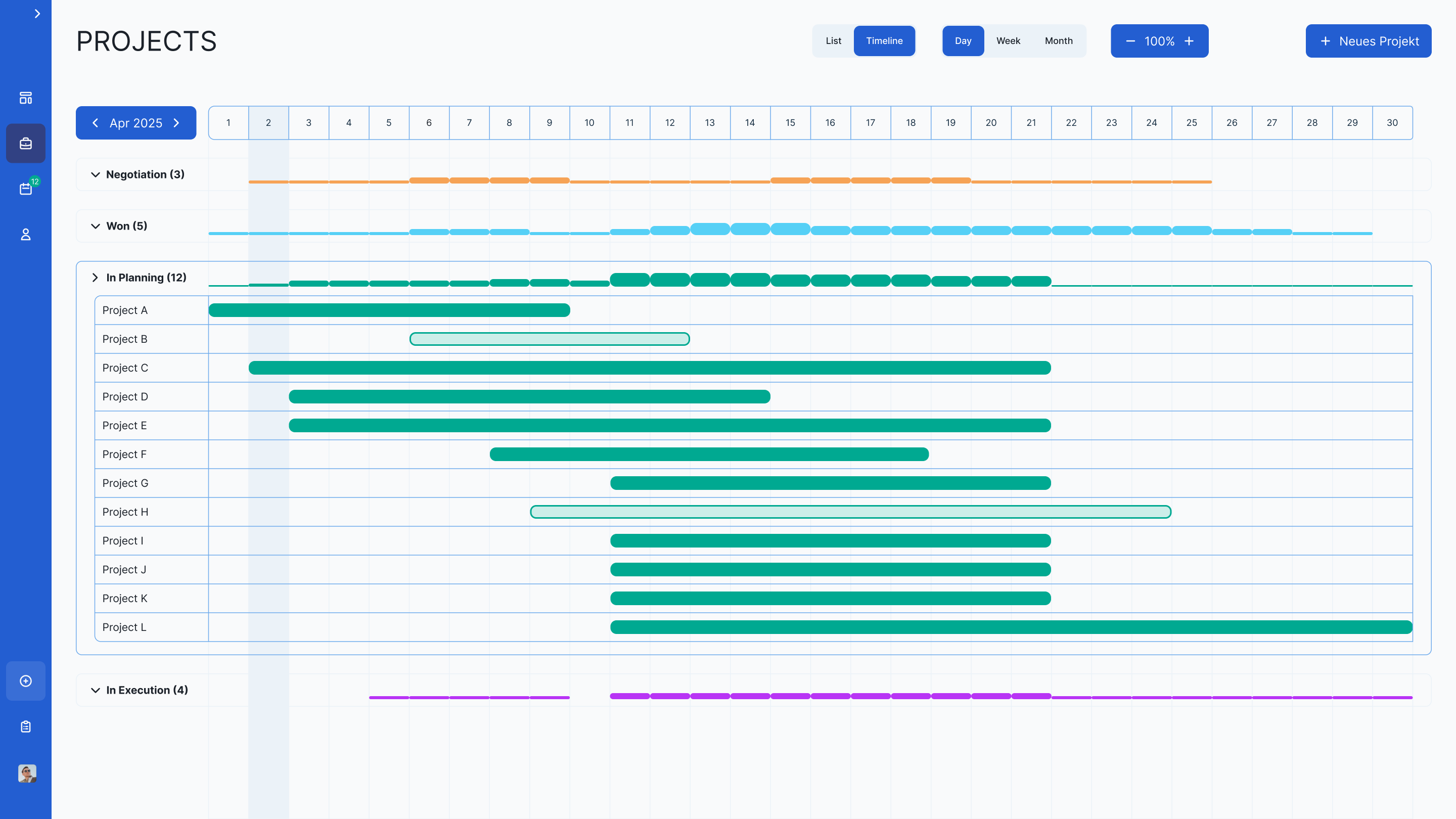
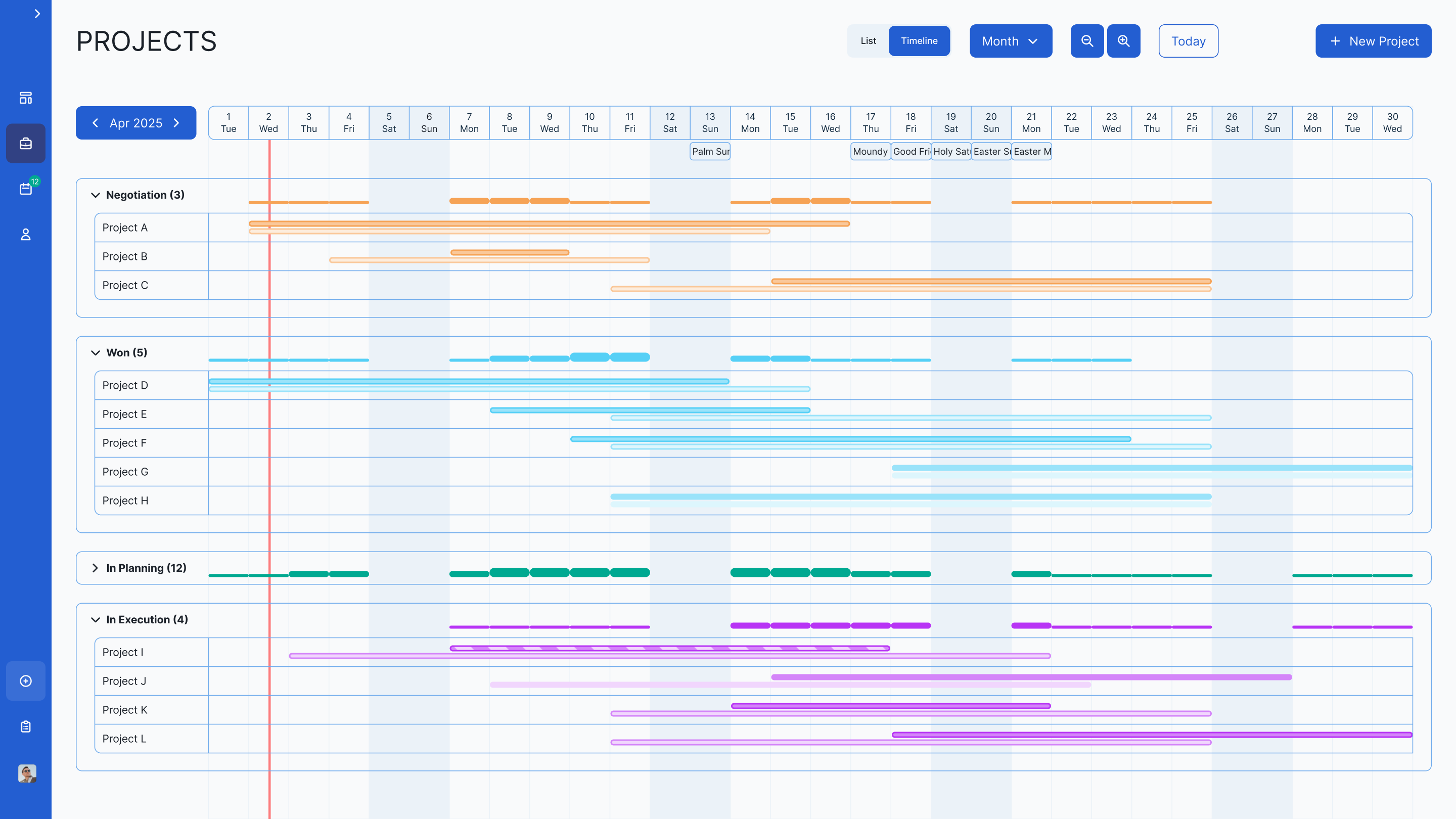
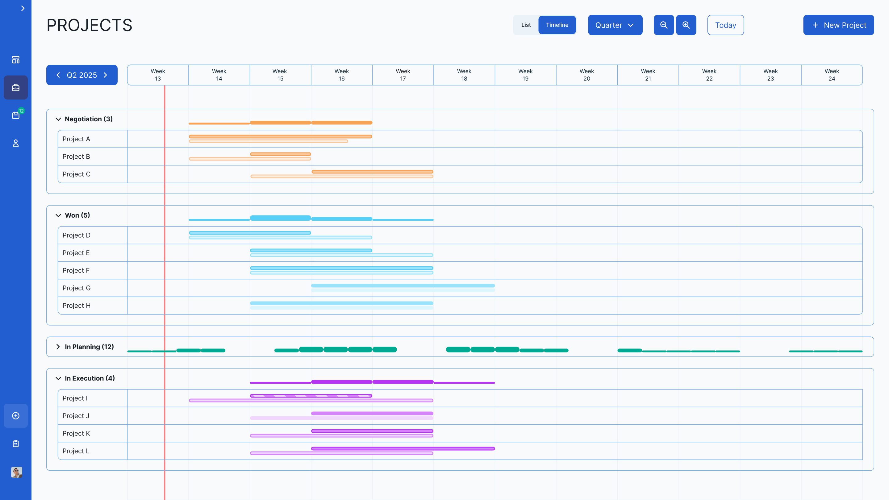
4. Projects Timeline Visualization
Problem: Construction project managers track projects across four concurrent lifecycle stages (Negotiation, Won, In Planning, Execution), each with distinct resource and scheduling implications. A flat view collapses this complexity.
Solution: Multi-Dimensional Timeline
Information architecture: Four lifecycle categories with clear status differentiation and logical workflow progression.
THREE DISPLAY MODES
- Monthly: individual days
- Quarterly: weeks for medium-term planning
- Yearly: months for long-term strategy
VISUAL SYSYTEM
- Planned: light-colored bars
- Active: saturated bars
- Paused: no stroke
- Live: border styling for immediate identification
- Workload heatmapping: visual intensity showing high/low activity periods for resource balancing
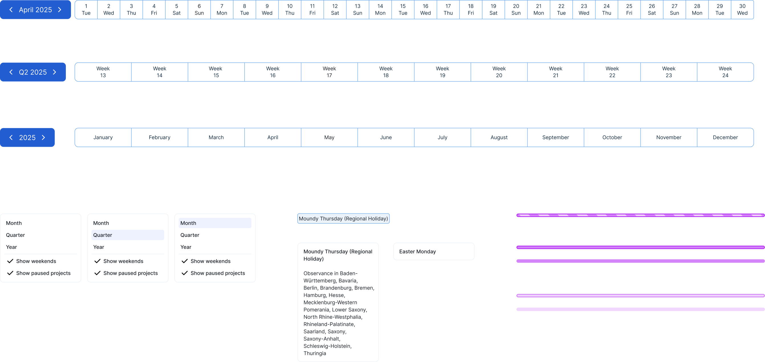
Construction-specific detail: Scaffolding shown as striped bars, a deliberate design choice for companies renting expensive equipment weekly across multiple sites. Visibility into allocation reduces over-rental and scheduling conflicts.
Interactions: Zoom, arrow-based temporal navigation, infinite horizontal scroll, expandable/collapsible rows, "show weekends" and "show paused projects" toggles, holiday/date chips with hover details.
Scoping note: Zoom and navigation interactions were documented for the next development cycle. Core timeline shipped within the project timeline.
REFLECTION
Working within an inherited system without a formal handoff forced a discipline I wouldn't have chosen voluntarily: understand before proposing. The constraint of not being able to redesign existing components pushed me toward genuinely additive solutions rather than merely cosmetic ones.
The timeline feature showed what domain-specific design actually requires. Generic data visualization patterns don't transfer cleanly to construction workflows. The scaffolding tracking, the four-stage lifecycle, and the workload heatmapping all came from understanding how construction professionals actually manage time and cost, not from pattern libraries.